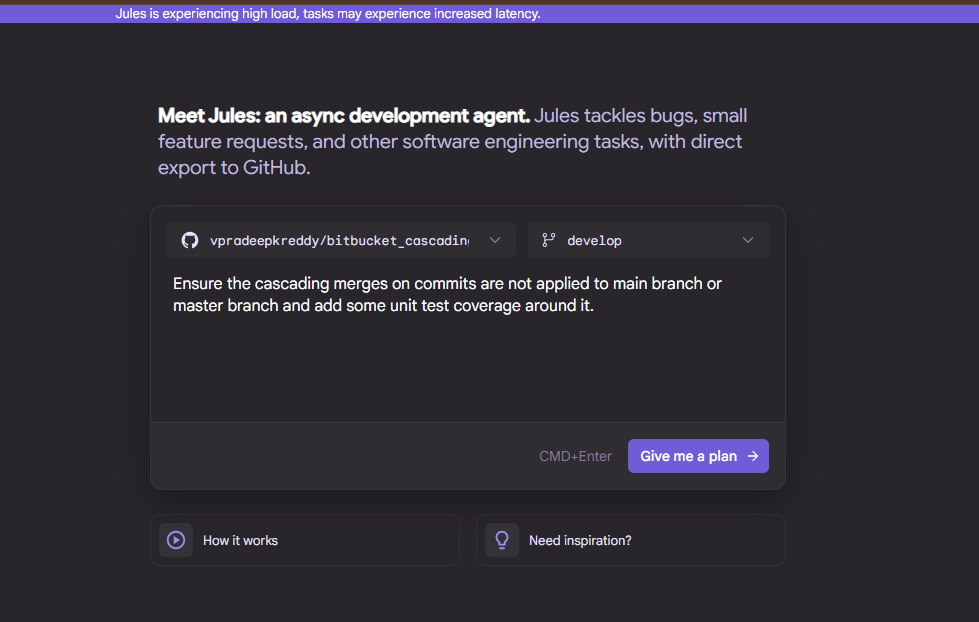
Coding Agents OpenAI's Codex, Google's Jules - Unleashed
Exploring how to setup OpenAI's Codex, Google's Jules to enhance software development.
%22%3E%0A%20%20%20%20%20%20%3Cstop%20offset%3D%220%25%22%20stop-color%3D%22%238b5cf6%22%2F%3E%0A%20%20%20%20%20%20%3Cstop%20offset%3D%22100%25%22%20stop-color%3D%22%233b0764%22%2F%3E%0A%20%20%20%20%3C%2FlinearGradient%3E%0A%20%20%20%20%3CradialGradient%20id%3D%22halo%22%20cx%3D%220.149%22%20cy%3D%220.274%22%20r%3D%220.55%22%3E%0A%20%20%20%20%20%20%3Cstop%20offset%3D%220%25%22%20stop-color%3D%22rgba(255%2C255%2C255%2C0.32)%22%2F%3E%0A%20%20%20%20%20%20%3Cstop%20offset%3D%2260%25%22%20stop-color%3D%22rgba(255%2C255%2C255%2C0)%22%2F%3E%0A%20%20%20%20%3C%2FradialGradient%3E%0A%20%20%3C%2Fdefs%3E%0A%20%20%3Crect%20width%3D%22800%22%20height%3D%22500%22%20fill%3D%22url(%23g)%22%2F%3E%0A%20%20%3Crect%20width%3D%22800%22%20height%3D%22500%22%20fill%3D%22url(%23halo)%22%2F%3E%0A%20%20%3Cg%20fill%3D%22rgba(255%2C255%2C255%2C0.12)%22%20stroke%3D%22rgba(255%2C255%2C255%2C0.18)%22%20stroke-width%3D%221%22%3E%0A%20%20%20%20%3Ccircle%20cx%3D%22119%22%20cy%3D%22137%22%20r%3D%2269%22%2F%3E%0A%20%20%20%20%3Ccircle%20cx%3D%22681%22%20cy%3D%22363%22%20r%3D%2249%22%2F%3E%0A%20%20%3C%2Fg%3E%0A%20%20%3Ctext%20x%3D%2250%25%22%20y%3D%2252%25%22%20text-anchor%3D%22middle%22%20dominant-baseline%3D%22middle%22%0A%20%20%20%20%20%20%20%20font-family%3D%22Inter%2C%20system-ui%2C%20sans-serif%22%20font-weight%3D%22800%22%0A%20%20%20%20%20%20%20%20font-size%3D%22170%22%20fill%3D%22rgba(255%2C255%2C255%2C0.92)%22%20letter-spacing%3D%22-6%22%3EBR%3C%2Ftext%3E%0A%20%20%3Ctext%20x%3D%2250%25%22%20y%3D%2278%25%22%20text-anchor%3D%22middle%22%0A%20%20%20%20%20%20%20%20font-family%3D%22Inter%2C%20system-ui%2C%20sans-serif%22%20font-weight%3D%22700%22%0A%20%20%20%20%20%20%20%20font-size%3D%2222%22%20letter-spacing%3D%226%22%0A%20%20%20%20%20%20%20%20fill%3D%22rgba(255%2C255%2C255%2C0.78)%22%3ETECHNOLOGY%3C%2Ftext%3E%0A%3C%2Fsvg%3E)
The landscape of web design has evolved dramatically with the introduction of powerful CSS layout systems like Flexbox and Grid. These tools have transformed how we approach responsive design, making it easier to create flexible, adaptive interfaces.
CSS Grid provides a two-dimensional layout system that has revolutionized how we structure web pages. Unlike earlier approaches that often required complex workarounds, Grid allows for precise control over both rows and columns simultaneously.
One of Grid's most powerful features is its ability to create complex layouts with minimal HTML markup. This separation of content and presentation aligns perfectly with best practices for web development.
While Grid excels at page-level layouts, Flexbox shines when it comes to arranging elements within components. Its one-dimensional approach makes it perfect for navigation bars, card layouts, and form elements that need to adapt to different screen sizes.
The combination of Flexbox and Grid creates a powerful toolkit for responsive design. Use Grid for the overall page structure and Flexbox for the internal layout of components.
Beyond layout systems, modern CSS offers numerous features that enhance responsive design:
While these modern techniques offer powerful capabilities, it's important to consider performance implications. Complex animations, excessive media queries, and large CSS files can impact load times and user experience.
The CSS specification continues to evolve, with exciting features on the horizon. Staying current with these developments will allow you to create increasingly sophisticated and user-friendly interfaces while maintaining clean, maintainable code.
By mastering these modern CSS techniques, you'll be well-equipped to build responsive interfaces that provide excellent user experiences across all devices and screen sizes.
Subscribe wiring is coming soon. For now, follow the daily news feed or connect on LinkedIn for updates.
Exploring how to setup OpenAI's Codex, Google's Jules to enhance software development.
%22%3E%0A%20%20%20%20%20%20%3Cstop%20offset%3D%220%25%22%20stop-color%3D%22%238b5cf6%22%2F%3E%0A%20%20%20%20%20%20%3Cstop%20offset%3D%22100%25%22%20stop-color%3D%22%233b0764%22%2F%3E%0A%20%20%20%20%3C%2FlinearGradient%3E%0A%20%20%20%20%3CradialGradient%20id%3D%22halo%22%20cx%3D%220.110%22%20cy%3D%220.240%22%20r%3D%220.55%22%3E%0A%20%20%20%20%20%20%3Cstop%20offset%3D%220%25%22%20stop-color%3D%22rgba(255%2C255%2C255%2C0.32)%22%2F%3E%0A%20%20%20%20%20%20%3Cstop%20offset%3D%2260%25%22%20stop-color%3D%22rgba(255%2C255%2C255%2C0)%22%2F%3E%0A%20%20%20%20%3C%2FradialGradient%3E%0A%20%20%3C%2Fdefs%3E%0A%20%20%3Crect%20width%3D%22800%22%20height%3D%22500%22%20fill%3D%22url(%23g)%22%2F%3E%0A%20%20%3Crect%20width%3D%22800%22%20height%3D%22500%22%20fill%3D%22url(%23halo)%22%2F%3E%0A%20%20%3Cg%20fill%3D%22rgba(255%2C255%2C255%2C0.12)%22%20stroke%3D%22rgba(255%2C255%2C255%2C0.18)%22%20stroke-width%3D%221%22%3E%0A%20%20%20%20%3Ccircle%20cx%3D%2288%22%20cy%3D%22120%22%20r%3D%2268%22%2F%3E%0A%20%20%20%20%3Ccircle%20cx%3D%22712%22%20cy%3D%22380%22%20r%3D%2238%22%2F%3E%0A%20%20%3C%2Fg%3E%0A%20%20%3Ctext%20x%3D%2250%25%22%20y%3D%2252%25%22%20text-anchor%3D%22middle%22%20dominant-baseline%3D%22middle%22%0A%20%20%20%20%20%20%20%20font-family%3D%22Inter%2C%20system-ui%2C%20sans-serif%22%20font-weight%3D%22800%22%0A%20%20%20%20%20%20%20%20font-size%3D%22170%22%20fill%3D%22rgba(255%2C255%2C255%2C0.92)%22%20letter-spacing%3D%22-6%22%3ETA%3C%2Ftext%3E%0A%20%20%3Ctext%20x%3D%2250%25%22%20y%3D%2278%25%22%20text-anchor%3D%22middle%22%0A%20%20%20%20%20%20%20%20font-family%3D%22Inter%2C%20system-ui%2C%20sans-serif%22%20font-weight%3D%22700%22%0A%20%20%20%20%20%20%20%20font-size%3D%2222%22%20letter-spacing%3D%226%22%0A%20%20%20%20%20%20%20%20fill%3D%22rgba(255%2C255%2C255%2C0.78)%22%3ETECHNOLOGY%3C%2Ftext%3E%0A%3C%2Fsvg%3E)
Exploring principles and practices for writing clean, maintainable code that stands the test of time.